A Consistent Identity
Fonts and colors needed a more cohesive direction.
BEAUTY & PERSONAL CARE
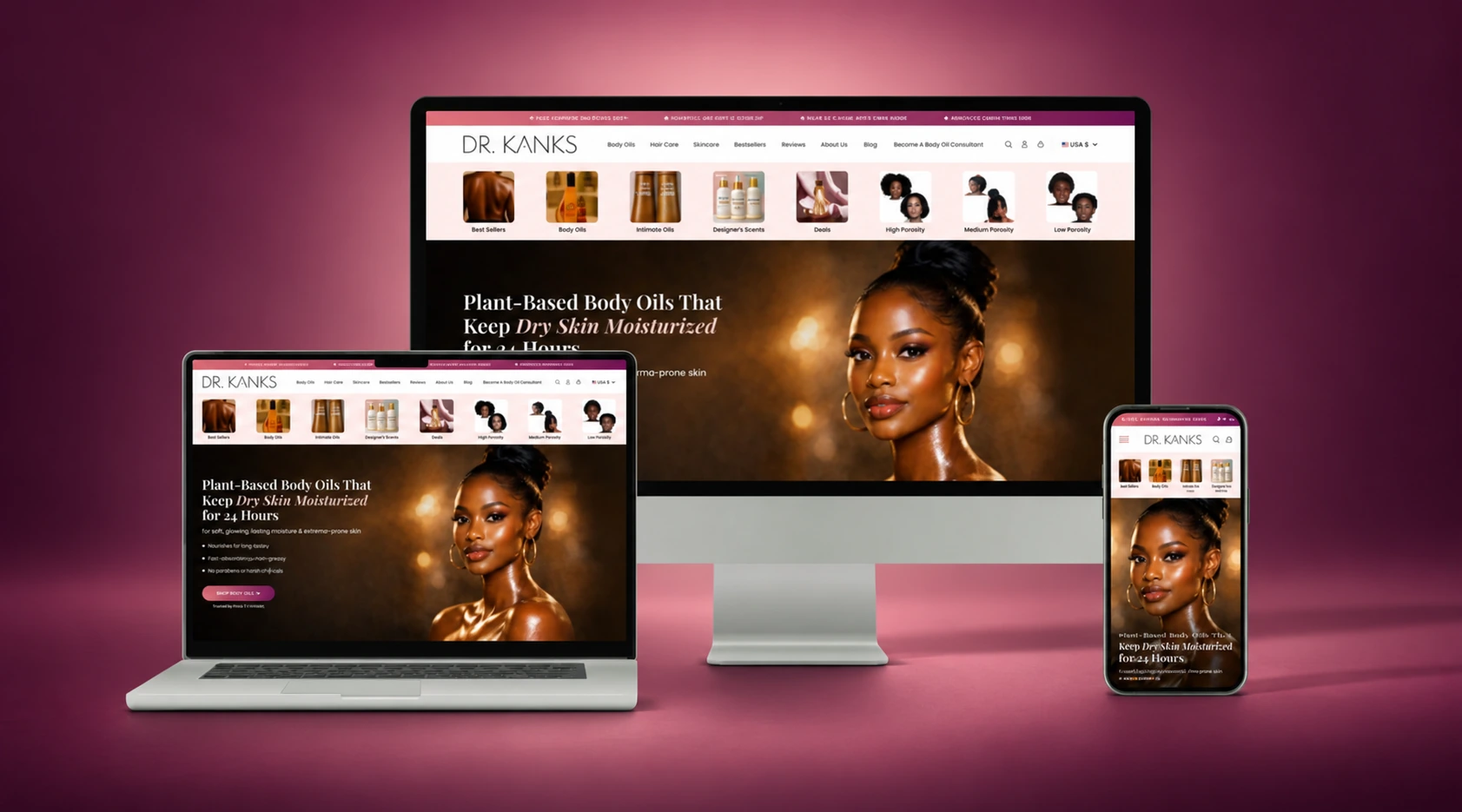
Seven key pages. Coordinated desktop and mobile designs. A new shopping experience for Dr. Kanks, designed within 15 days.
The Redesign
Cynthia Kankeu asked Tech Striker to rethink the Dr. Kanks ecommerce experience, bringing a more consistent visual identity and clearer shopping journey to a store focused on plant-based skincare, body oils and hair care.
Our scope was UI/UX design in Figma and Adobe Photoshop, with desktop and mobile layouts for all seven pages.
The Challenge
Fonts and colors needed a more cohesive direction.
Alignment and spacing varied across the existing pages.
The layout made products and information harder to find.
Product information needed a clearer reading order.
The smaller-screen experience needed dedicated attention.
The store needed a visual system that connected its pages.
Our Approach
Review the beauty and skincare context and customer expectations.
Use the client's references to establish the preferred direction.
Bring font pairing, color and theme direction together.
Organize sections, spacing and product information in the designs.
Create desktop and mobile layouts for every page in scope.
Desktop Before & After
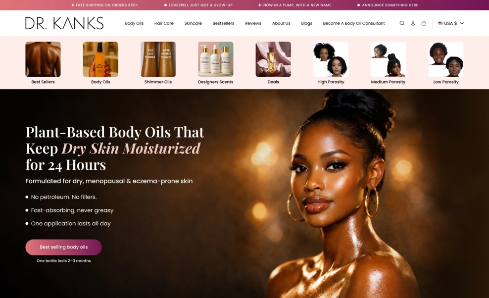
The new design separates navigation, visual product categories and the main message. A calmer hierarchy gives the imagery and shopping action their own space.
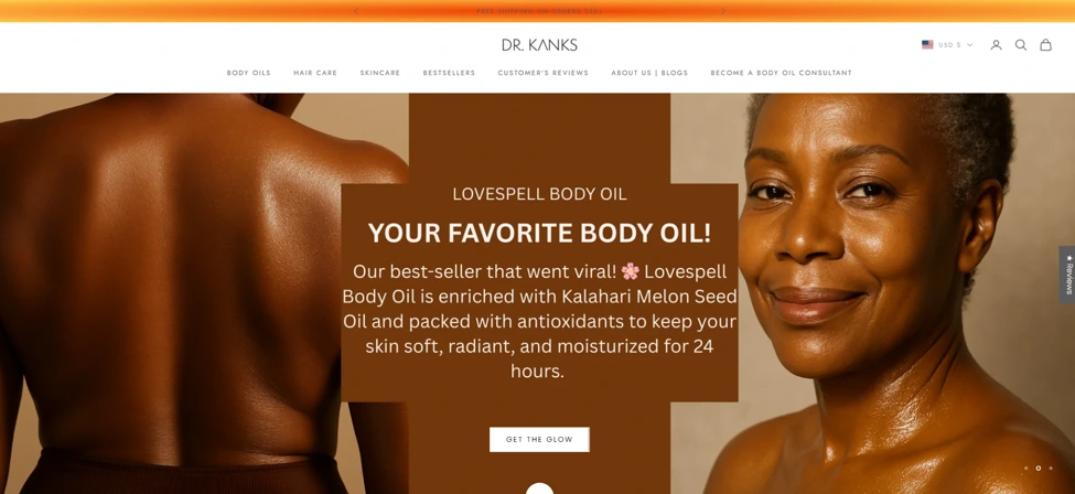
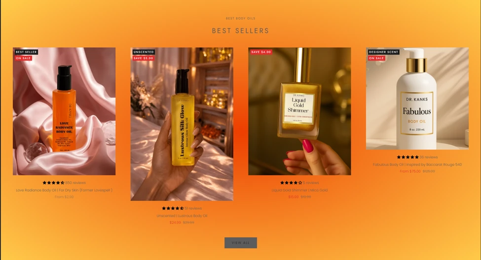
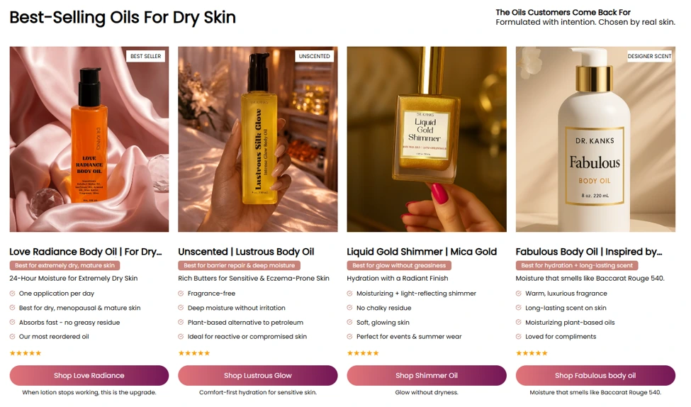
Consistent image areas, benefit-led information and individual shopping buttons replace the less structured product presentation.
Product Experience
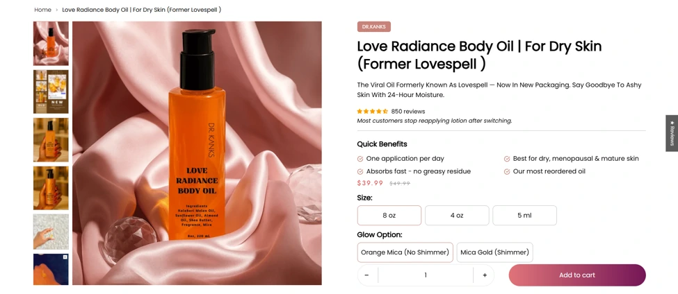
The product-page design brings the image gallery, benefits, price, size and finish options into a clearer sequence before the purchasing action. The aim was to help shoppers understand the product before choosing.
Mobile Before & After
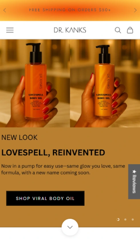
Mobile-specific layouts were created for all seven pages. These homepage captures show the change in navigation, category discovery, imagery and the main shopping action, with a dedicated composition for the smaller screen.

The Design Scope
Desktop + Mobile
Desktop + Mobile
Desktop + Mobile
Desktop + Mobile
Desktop + Mobile
Desktop + Mobile
Desktop + Mobile
Design Tools & Visual System
Designed in Figma and Adobe Photoshop.
A coordinated font direction and clearer heading hierarchy.
A softer rose-to-plum direction balanced with white space.
More consistent spacing, alignment and product presentation.
The Outcome
Dr. Kanks received a coordinated UI/UX redesign across seven key ecommerce pages, with desktop and mobile versions delivered within the agreed 15-day window. The designs establish a more cohesive visual identity and a clearer way to present the products.
Visit Dr. Kanks (opens in a new tab)The current store may have evolved since the project. The supplied captures above document the redesign.
Explore our web design and UX services, Shopify services and broader Website Solutions, or browse more Case Studies.